From time to time it becomes necessary to update the look and feel of your corporate logo. I’ve seen everything from complete redesign to slight color changes; however, the desired outcome is always the same: better branding, which in turn translates into better emotional connection between you and your clients.
I was approached by Preferred Wound Solutions to help create their website and one of the first things we targeted was their logo. They weren’t interested in a complete overhaul as they had promotional material printed with the old one, but they definitely were in the market for a new look.
If you’ve never embarked on this process, it may have been because it seems daunting. I didn’t want and they couldn’t afford a long drawn-out process so I put my thinking hat on and came up with some progressive worksheets that ended up working very well.
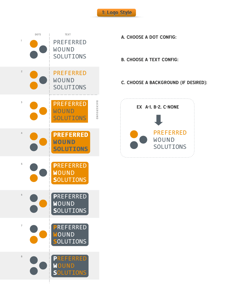
Step 1: Style – Discover the right style for the logo. For this, I offered a three-step process that helped them decide the critical elements of the logo.
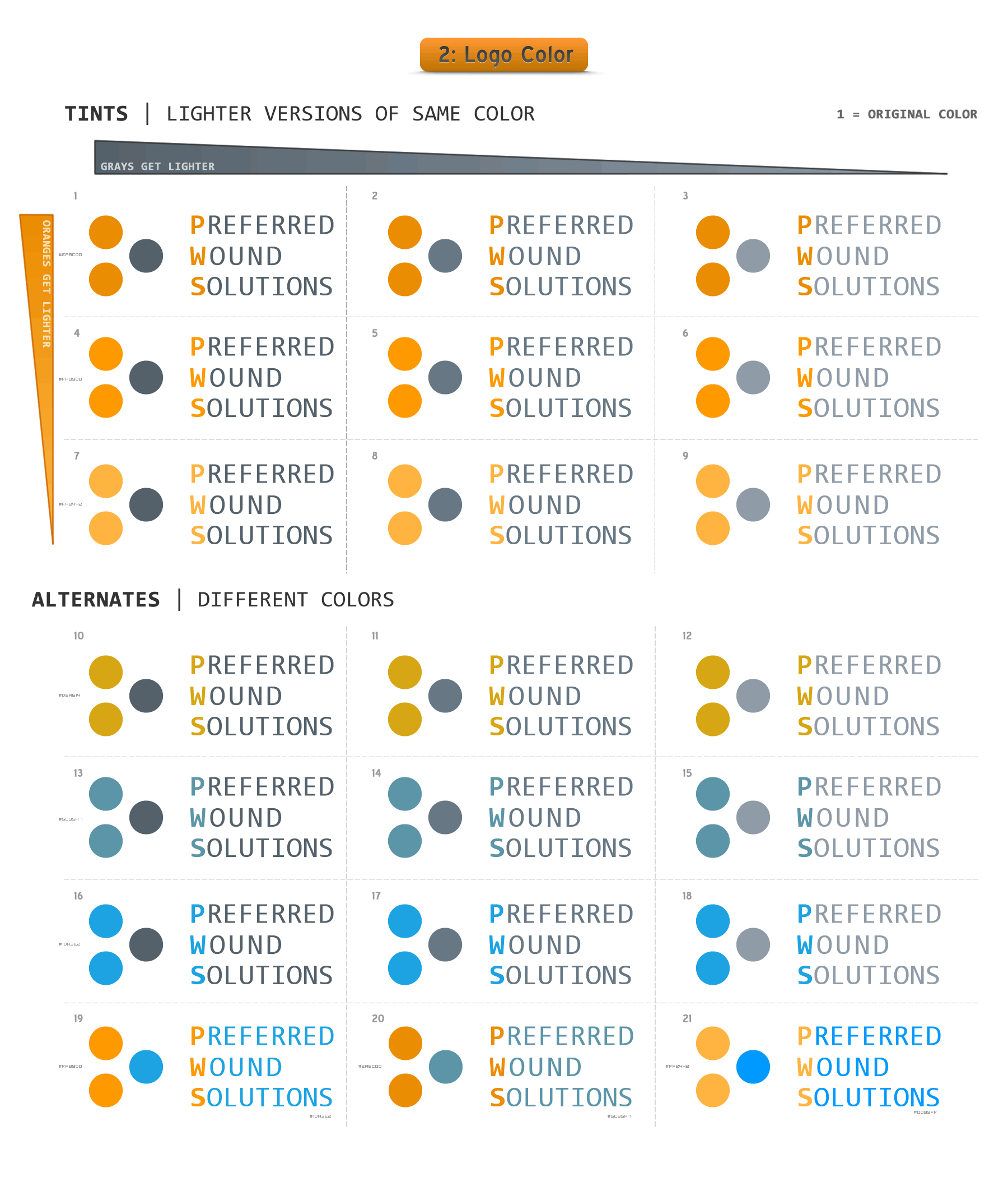
As you can see, they were to choose a dot style, a text style, and a background (if desired). The result of this, which only took a few hours for them to decide, helped us move to Step 2 – Color. This resulted in a new worksheet based on their desire for a “brighter orange” to be used as well as their results from the style worksheet.

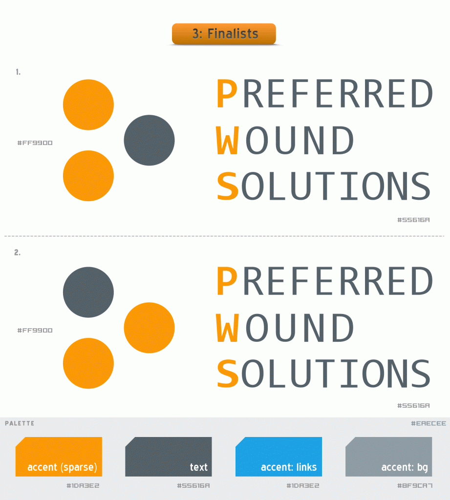
We are sitting pretty now – and it is all right there in one place. This, as it turns out, was a crucial step as their final choice was #2 above – the last-minute dot config.
All in all, this was a great process for both the client and the designer. It was clear, and clean and provided a very visual client with the needed options to decide quickly.

From this, something interesting happened – they chose the entire color palette for the site. I knew they had blue in their original logo and I didn’t want to totally abandon that color so I threw some of those options in for good measure. In a similar fashion, they came back quickly with their logo choice but requested another dot configuration and asked to see them side-by-side in their final colors. A “finalist” worksheet was then developed.

In summary, here are the principles I took away from this experience:
- Focus on one aspect at a time | The tendency is to do color, style, and palette all in the same step, but by forcing each aspect to be decided on in order, it helped remove some of the clutter from the process
- Give them enough options to make it complete, but not so much as to overwhelm them. What you’re after is a balance to allow your client to move to the next step with one or two candidates that can be explored in the next step.
- Be quick | This process is pretty exciting to the client and I felt an anticipation for the next step, so I moved very quickly on each successive worksheet so that emotion could carry over and keep the process rolling along.
- Add some style | This is also a great time to showcase some design skills you have. Little things like palette swatches and dotted lines make a difference and can improve the relationship as they will be able to see that you care about your craft.
There’s nothing magical about this process, but I was amazed at how well it worked and I’ll be using it in the future.